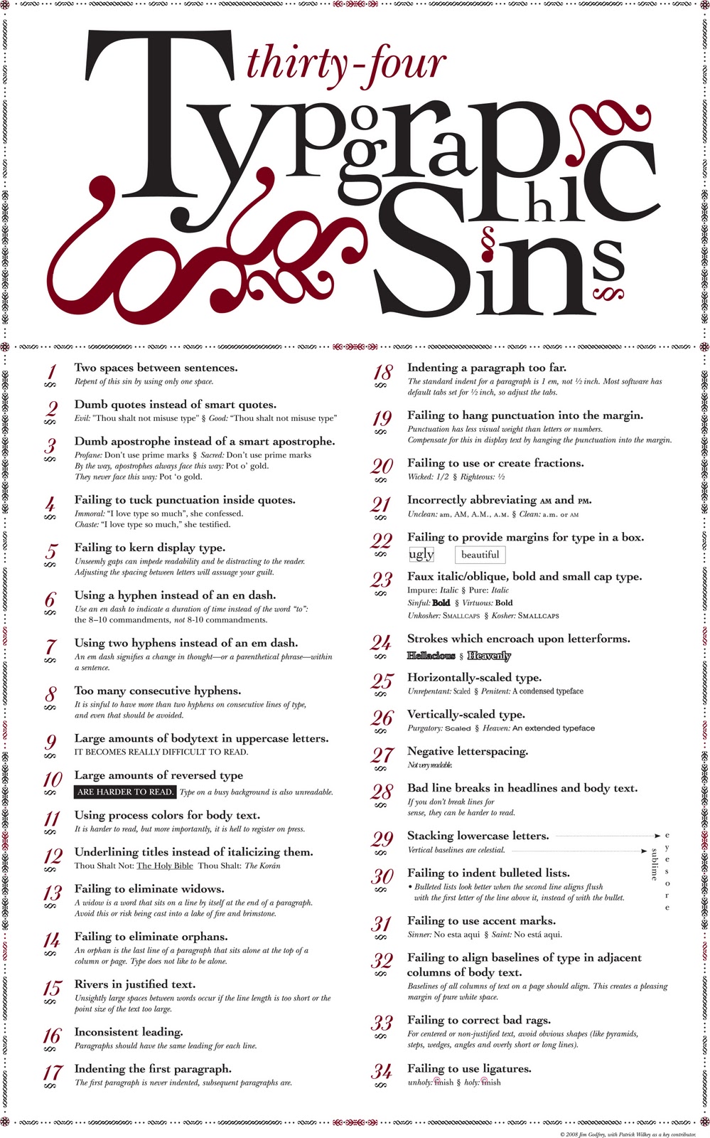
Helpful infographic for everyone involved in formatting material for print.
From Jim Godfrey design, where you can purchase this as a print. There’s also a pdf of this image available for download.
Click on image to enlarge.
HT: 22Words.

- Comment
- Reblog
-
Subscribe
Subscribed
Already have a WordPress.com account? Log in now.

It’s just so small that I can’t read it.
Did you try clicking on the image?
Number 31 should read, “No está aquí,” with an accent mark over the “i.”
I have to take your word for it.
Thanks.
maybe number 35 should be making the information so small people can’t read it!?
Yes this is impossible to read
#35: NEVER use script typefaces in all caps! Nobody can read that crap!
There’s a mistake in the second sentence of your intro. It reads “…where you can purchase a this as a poster”. Delete “a”.
You have to understand the origin of the first sin. Back in the stone age, when we used to type on typewriters, that was THE #1 rule. 2 spaces before a sentence. I went to Katherine Gibbs and that was 4 points off your letter if you had only one. This was beaten into us. This was back in the 80s before word processing programs. I don’t know when this new rule of having only 1 space between sentences came about, but it’s a very hard rule to change.
Sheri, I learned to type on a manual machine in the 70’s, so double spacing between sentences was part of my training as well, and unlearning it was part of my transition to word processing in the late 80’s and early 90’s.
Fortunately though, learning typing was the most usable skill gained from all my secondary schooling.
I began my training in the graphic arts in 1961 and was taught that it’s an insult to a reader’s intelligence to put two spaces at the end of a sentence. When there is already a period, why put in an extra space?
When I was taught typing on a manual typewriter in the 70’s there were two spaces at the end of a sentence.
Took a while to get out of the habit when the transition took place to word processing.
I began my training in the graphic arts in 1961 and was taught that it an insult to a reader’s intelligence to put two spaces at the end of a sentence. It there is period, why put in two spaces? It’s obvious the sentence has finished.
True typographers always had a different #1 rule beaten into them: Only ONE space after a period. This goes back to hand set metal type. The reason my typing teacher and Ms. Gibbs demanded two spaces was that typewriter fonts were “monospaced” back then. To make a mechanical typewriter work, a capital monospaced letter “M” had to take up the same amount of horizontal space as a lower-cased “i” or even a period. So to visually make the letters more even, we were taught to add two spaces after a period–but only on older typewriters. When proportional typefaces for typewriters (IBM Selectric) and word processors evolved (and looked more like beautiful typography), the old two spaces rule died.
When I learned to type on a manual typewriter two spaces after a full stop (period) was the standard. Took me a few years to get it out of my system in the word processing era of the 80s and 90s.
Number 4 is American-centric, since punctuation is put outside quotes both in British English and in French. Therefore, number 4 cannot be classified as a typographic sin.
Wonderful post, but the link to Jim Godfrey’s original is out of date. He is currently at https://jimgodfrey.com/typographic-sins-poster/
Thank You!